В сфере веб-разработки HTML5 Canvas API выступает в качестве основного инструмента для рендеринга графики и создания анимации непосредственно в браузере. Он предлагает разработчикам и дизайнерам обширную площадку для воплощения своих визуальных идей в жизнь. В отличие от других графических методов, основанных на SVG или других элементах DOM, Canvas использует растровый подход, позволяя напрямую рисовать фигуры, изображения и даже анимацию.
Зачем выбирать Canvas для своего приложения React?
Интеграция Canvas в приложение React открывает мир возможностей. Вот основные преимущества:
* Управление на уровне пикселей: Canvas дает вам свободу манипулировать отдельными пикселями, позволяя создавать сложные и подробные графические представления.
* Производительность. Для визуализаций с большим объемом данных или сложной анимации Canvas превосходит свои аналоги, такие как SVG, особенно при работе с большим количеством объектов.
* Гибкость и творческий подход: от диаграмм и графиков до интерактивных игр — универсальность Canvas делает его идеальным выбором для широкого спектра приложений.
* Интеграция с React. Canvas органично сочетается с компонентной архитектурой React, позволяя создавать высокоинтерактивные и динамичные пользовательские интерфейсы.
Давайте построим круговую и гистограмму в приложении React, используя Canvas.
Для этого нам нужно создать простое приложение React. Я сделал это с помощью Vite. Затем нам нужно создать компоненты, которые будут представлять диаграммы, и интегрировать их в основной js-компонент приложения.
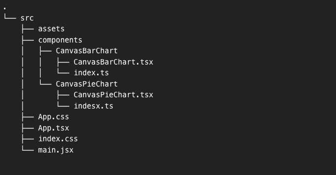
Вот как будет выглядеть структура проекта.
Давайте перейдем к коду каждой диаграммы. Я оставил объяснение каждого шага в комментариях к коду.
Гистограмма
import React, { useRef, useEffect } from 'react';

export const CanvasBarChart = ({ data, labels }) => {
    // useRef to reference the canvas element
    const canvasRef = useRef(null);

    useEffect(() => {
        // Get the canvas element and its drawing context
        const canvas = canvasRef.current;
        const ctx = canvas.getContext('2d');

        // Clear the canvas to start fresh each render
        ctx.clearRect(0, 0, canvas.width, canvas.height);

        // Settings for the bar chart
        const padding = 50; // Space around the chart to not draw on the edge of the canvas
        const barWidth = 40; // The width of each bar
        const gap = 15; // The gap between each bar
        const yAxisLabelPadding = 10; // Space between the Y-axis and the labels
        let x = padding * 1.5; // Initial X position, set to padding times 1.5 to offset the first bar

        // Calculate the maximum value for the Y-axis
        const maxValue = Math.max(...data);

        // Drawing the Y-axis
        ctx.beginPath();
        ctx.moveTo(padding, padding); // Start at the upper-left corner with padding
        ctx.lineTo(padding, canvas.height - padding); // Draw down to the bottom-left corner with padding
        ctx.strokeStyle = '#000'; // Set the color of the axis line
        ctx.stroke(); // Execute the drawing of the line

        // Drawing the X-axis
        ctx.beginPath();
        ctx.moveTo(padding, canvas.height - padding); // Start at the bottom-left corner with padding
        ctx.lineTo(canvas.width - padding, canvas.height - padding); // Draw to the bottom-right corner with padding
        ctx.stroke(); // Execute the drawing of the line

        // Drawing bars and X-axis labels
        data.forEach((value, index) => {
            // Set the fill color for the bar
            ctx.fillStyle = '#3498db';
            // Draw the bar
            const barHeight = (value / maxValue) * (canvas.height - padding * 2); // Calculate bar height based on value
            ctx.fillRect(x, canvas.height - padding - barHeight, barWidth, barHeight); // Draw the bar

            // Set the fill color for the text (X-axis labels)
            ctx.fillStyle = '#000';
            ctx.font = '14px Arial';
            // Draw the X-axis label below the bar
            ctx.fillText(labels[index], x + (barWidth / 2) - (ctx.measureText(labels[index]).width / 2), canvas.height - padding + 20);

            x += barWidth + gap; // Move the x position for the next bar
        });

        // Drawing Y-axis labels
        const numberOfYLabels = 5; // For example, 5 labels on the Y-axis
        for (let i = 0; i <= numberOfYLabels; i++) {
            const yValue = (maxValue / numberOfYLabels) * i; // Calculate the value for the label
            const yPosition = canvas.height - padding - (yValue / maxValue) * (canvas.height - padding * 2); // Calculate the Y position

            // Draw the Y-axis label
            ctx.fillStyle = '#000';
            ctx.font = '14px Arial';
            ctx.fillText(yValue.toFixed(0), padding - yAxisLabelPadding - ctx.measureText(yValue.toFixed(0)).width, yPosition + 4); // Center text vertically
        }

    }, [data, labels]); // Dependencies of useEffect: the component will re-render when data or labels change

    // Return the canvas element with a ref attached
    return <canvas ref={canvasRef} width={500} height={500} />;
};
Круговая диаграмма
import React, { useRef, useEffect } from 'react';

export const CanvasPieChart = ({ data, colors, labels }) => {
    const canvasRef = useRef(null);

    useEffect(() => {
        // Get the canvas context
        const canvas = canvasRef.current;
        const ctx = canvas.getContext('2d');
        // Clear the entire canvas to start fresh
        ctx.clearRect(0, 0, canvas.width, canvas.height);

        // Setup for the pie chart
        let total = data.reduce((sum, value) => sum + value, 0);
        let startAngle = 0;
        const radius = canvas.height / 4; // Pie radius is 1/4 the height of the canvas
        const centerX = radius + 20; // Center the pie on the left part of the canvas
        const centerY = radius + 20;

        // Draw the pie slices
        data.forEach((value, index) => {
            // Calculate the end angle of the slice
            let sliceAngle = (value / total) * 2 * Math.PI;
            // Set the color for the current slice
            ctx.fillStyle = colors[index];
            // Start a new path for the slice
            ctx.beginPath();
            // Move to the center of the pie
            ctx.moveTo(centerX, centerY);
            // Draw the arc for the slice
            ctx.arc(centerX, centerY, radius, startAngle, startAngle + sliceAngle);
            // Close the path and fill the slice
            ctx.closePath();
            ctx.fill();
            // Update the start angle for the next slice
            startAngle += sliceAngle;
        });

        // Setup for the legend
        let legendY = 20; // Start position for the legend on the canvas
        const legendX = 2 * radius + 40; // Position the legend to the right of the pie

        // Draw the legend
        labels.forEach((label, index) => {
            const legendColor = colors[index];
            // Draw the color box for the legend
            ctx.fillStyle = legendColor;
            ctx.fillRect(legendX, legendY, 20, 20); // Draw the legend color box
            // Set the text style for the legend
            ctx.fillStyle = '#000';
            ctx.font = '16px Arial';
            // Draw the label text beside the color box
            ctx.fillText(label, legendX + 25, legendY + 15);
            // Update the Y position for the next legend item
            legendY += 30;
        });
    }, [data, colors, labels]); // Redraw when data, colors, or labels change

    return <canvas ref={canvasRef} width={600} height={600} />;
};
JS-приложение
import { CanvasBarChart } from "./components/CanvasBarChart/CanvasBarChart.jsx";
import { CanvasPieChart } from "./components/CanvasPieChart/CanvasPieChart.jsx";
import './App.css'

function App() {
    const barData = [100, 200, 150, 250, 300]; // Sample data
    const barLabels = ['Jan', 'Feb', 'Mar', 'Apr', 'May']; // Sample labels

    const pieData = [300, 150, 100, 200]; // Sample data for pie chart
    const pieColors = ['#FF6384', '#36A2EB', '#FFCE56', '#4BC0C0']; // Sample colors for pie chart
    const pieLabels = ['Category A', 'Category B', 'Category C', 'Category D']; // Example labels

    return (
        <div className="App">
            <div className="chart">
                <CanvasBarChart data={barData} labels={barLabels} />
            </div>
            <div className="chart">
                <CanvasPieChart data={pieData} colors={pieColors} labels={pieLabels} />
            </div>
        </div>
    );
}

export default App
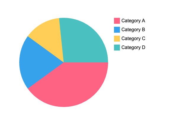
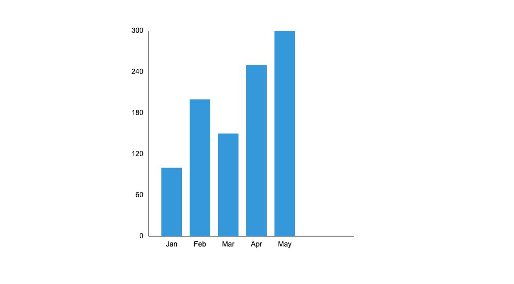
А вот так выглядят графики:
Пирог
Бар
Завершая это путешествие по яркому миру Canvas в React, становится ясно, что мощь и гибкость Canvas делают его беспрецедентным выбором для визуализации данных в веб-приложениях. Независимо от того, являетесь ли вы опытным разработчиком или любопытным новичком, мир Canvas в React — это приключение, в которое стоит отправиться.
И всем моим дорогим читателям: помните, что каждый пиксель на вашем холсте — это вселенная возможностей, поэтому продолжайте рисовать, продолжайте экспериментировать и, самое главное, получайте удовольствие! Ваша креативность — единственный предел в этом идеальном по пикселям мире. Если вы хотите поэкспериментировать с кодом, упомянутым в статье, скачайте его на моем github. . Ура!